Client: McDonald's/Archways to Opportunity
Challenge: Redesign their logo to create a meaningful connection with program participants within a tight timeframe.
Solution: We crafted a design that effectively conveys the themes of education and opportunity.
Summary: This project was an enjoyable experience where I had the opportunity to craft something that brought purpose and meaning to the program participants. The client's positive reception of the logo, particularly from a client known for meticulous feedback, was a pleasant surprise. Usually, it involves multiple rounds of edits, but this time, I managed to meet and exceed expectations. It felt like a significant win for me.
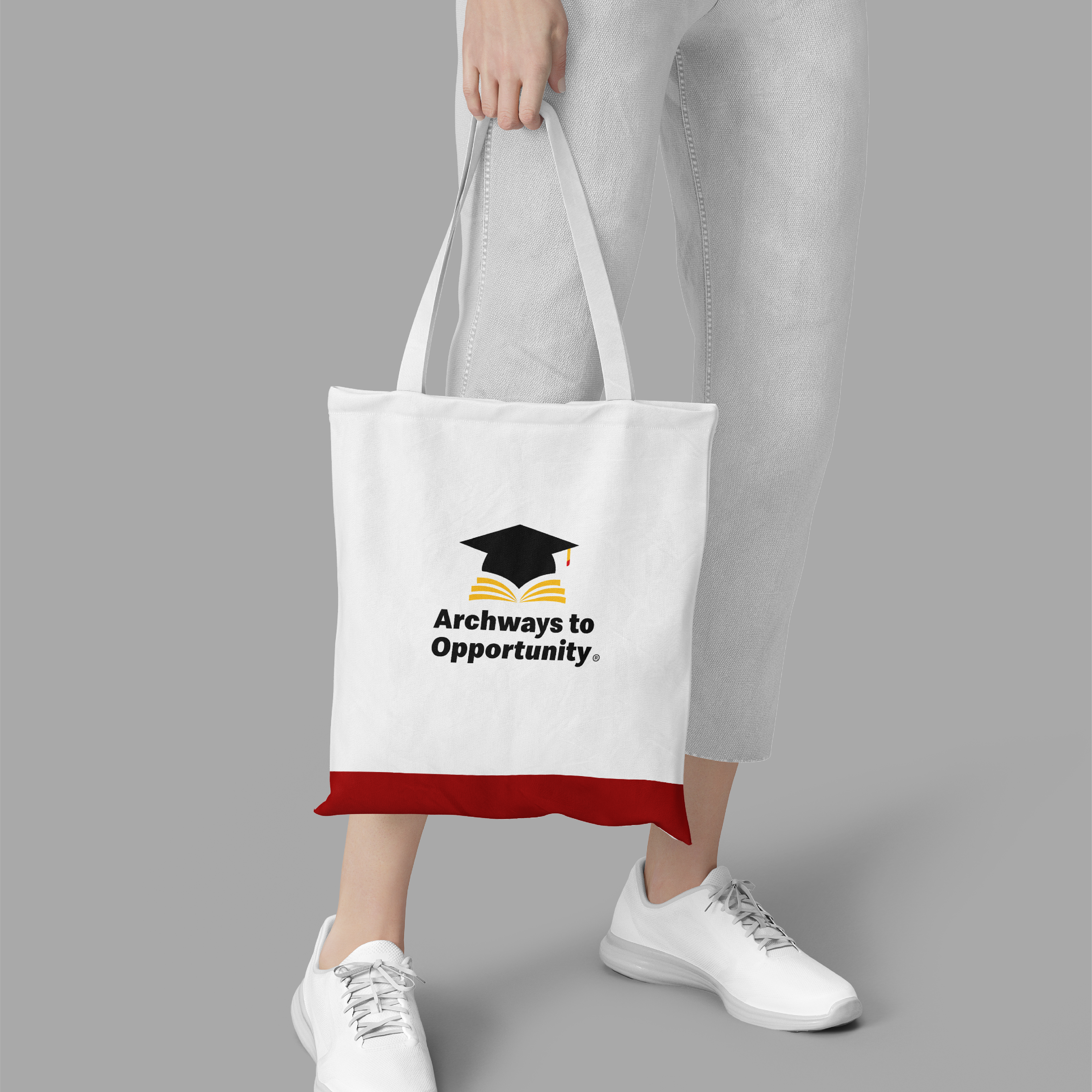
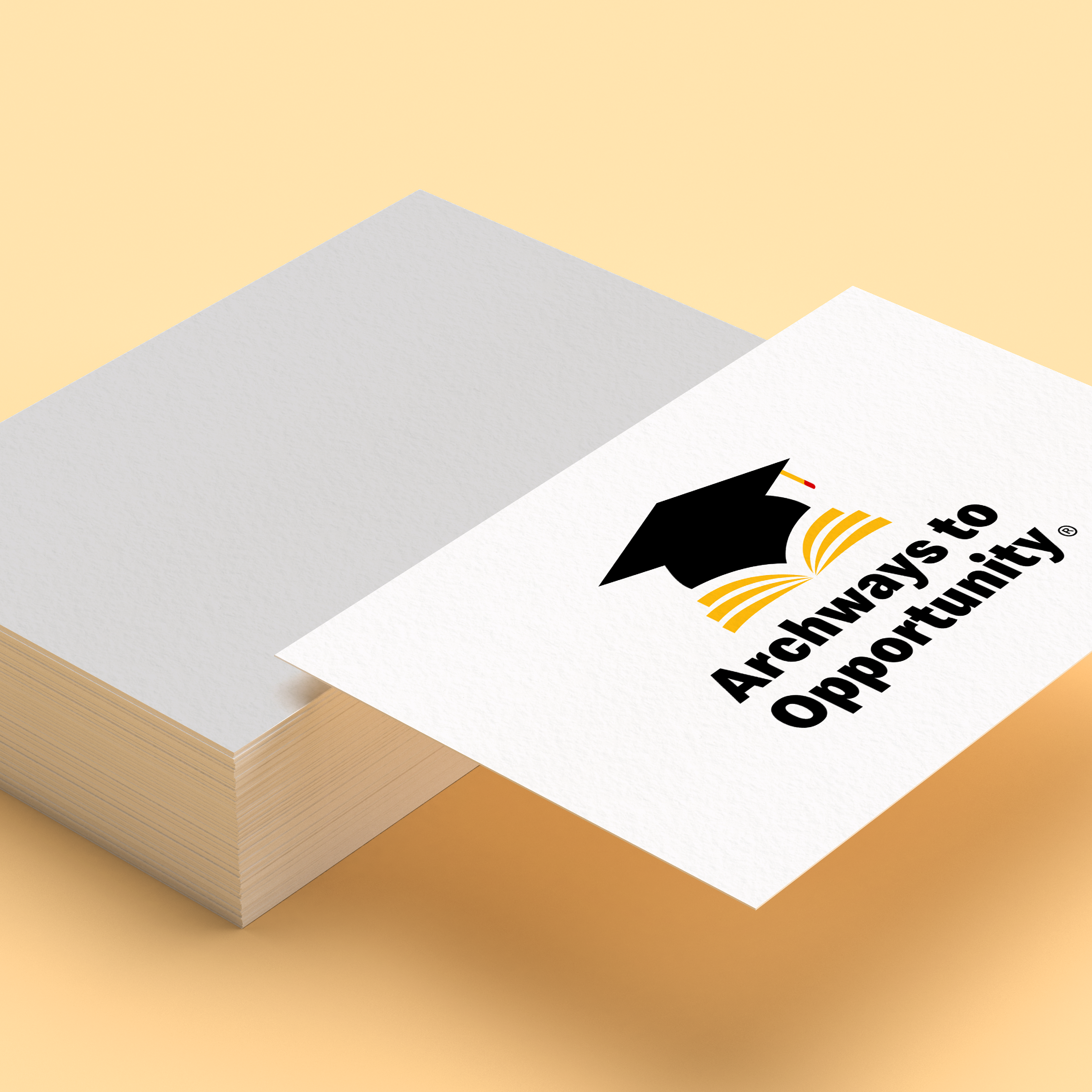
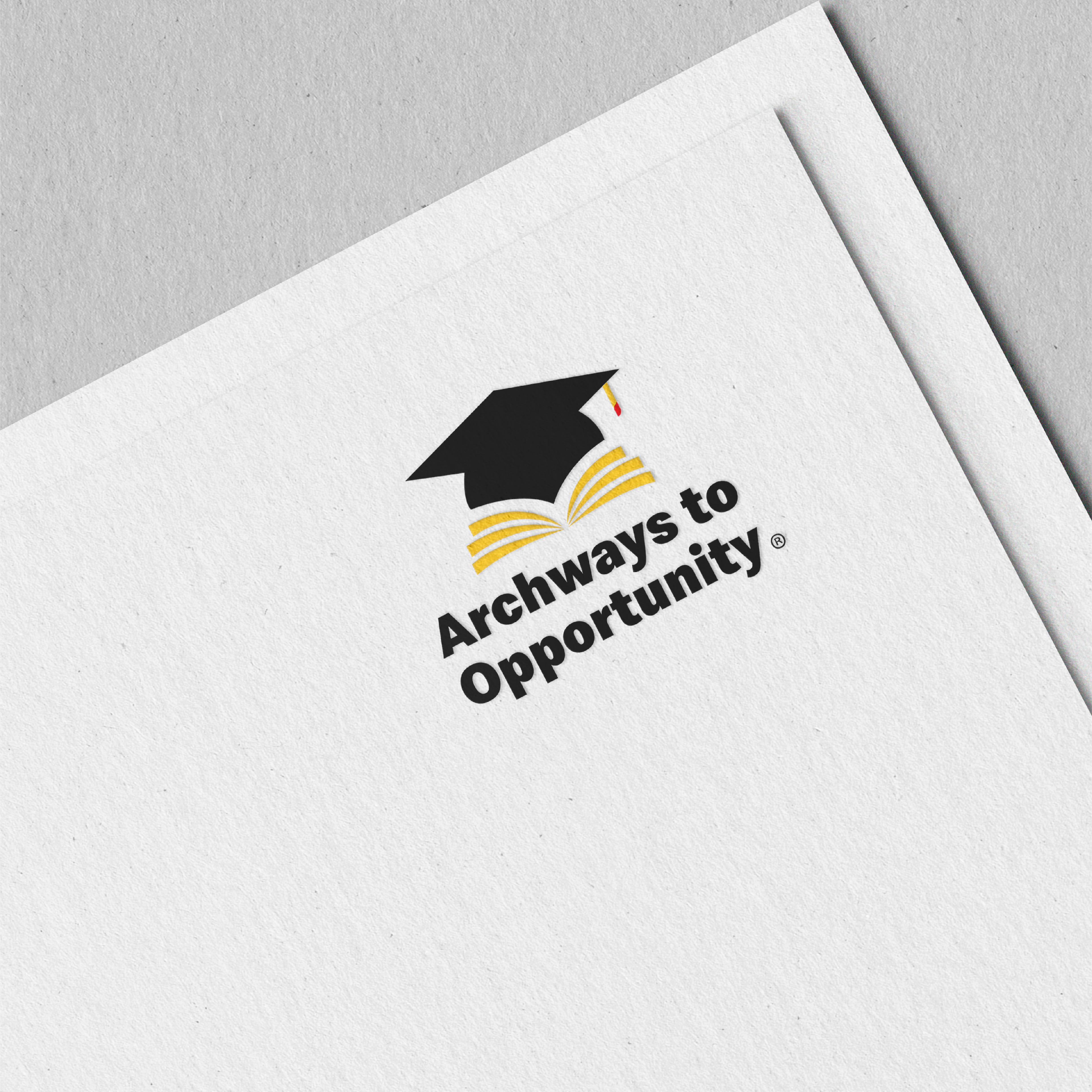
Logo Meaning: The focal point of the logo features a graduation cap, symbolizing not only educational attainment but also a sense of accomplishment. The graceful curvature of pages beneath the cap reinforces the educational aspect while forming graceful arches between the cap and the pages. These arches, in a symbolic sense, represent the program's capacity to establish a strong foundation and offer progressive steps towards an individual's path to success. Furthermore, the yellow pages take on the appearance of sun rays, forming an aesthetically appealing link to the concept of opportunity.
This redesigned logo is a powerful representation of education, achievement, and the promising opportunities provided by the Archways to Opportunity program.
